The Component Gallery: A Comprehensive Guide to UI Components and Design Systems
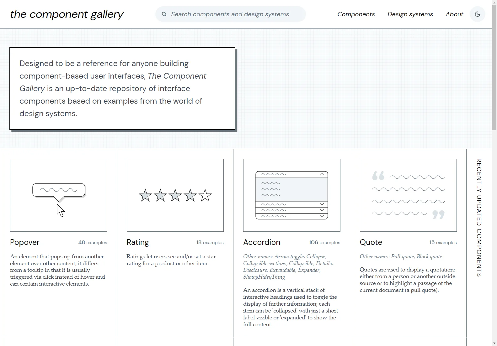
The Component Gallery serves as an invaluable resource for anyone involved in building component-based user interfaces. It offers a continuously updated collection of interface components, drawing inspiration from leading design systems across various industries. This detailed guide explores its features, benefits, and the wealth of resources it provides.
Key Features of The Component Gallery
- Extensive Component Library: The gallery boasts a wide array of components, including buttons, accordions, pagination, tabs, and more. Each component is meticulously documented with multiple examples showcasing diverse implementations.
- Design System Showcase: It features a curated selection of prominent design systems, offering insights into their design philosophies, code implementations, and usage guidelines. This allows developers to learn from best practices and integrate proven design patterns into their projects.
- Code Examples: The gallery provides code examples in various technologies such as React, HTML, and Vue.js, enabling developers to quickly integrate components into their projects.
- Regular Updates: The Component Gallery is regularly updated with new components and design systems, ensuring that it remains a current and relevant resource.
- Detailed Documentation: Each component and design system includes comprehensive documentation, covering usage guidelines, accessibility considerations, and best practices.
Benefits for Developers and Designers
- Increased Efficiency: By providing readily available, well-documented components, The Component Gallery significantly accelerates the development process, reducing the time and effort required to build user interfaces.
- Improved Consistency: Using standardized components ensures consistency in design and functionality across different parts of an application, leading to a more cohesive and user-friendly experience.
- Enhanced Accessibility: The gallery emphasizes accessibility, ensuring that components adhere to accessibility guidelines, making applications more inclusive for users with disabilities.
- Access to Best Practices: By showcasing leading design systems, the gallery provides access to best practices in UI design and development, enabling developers to learn from the most successful projects.
Examples of Featured Components
The Component Gallery includes a wide variety of components, including:
- Buttons: Various styles and functionalities for triggering actions.
- Accordions: For displaying collapsible sections of content.
- Tabs: For navigating between multiple panels of information.
- Pagination: For splitting content across multiple pages.
- Popovers: For displaying contextual information.
- Rating Components: For allowing users to provide star ratings.
- Breadcrumbs: For showing the user's location within a website's navigation hierarchy.
Examples of Featured Design Systems
The gallery showcases a diverse range of design systems, including:
- Flowbite: A popular Tailwind CSS-based design system.
- PatternFly: A comprehensive design system from Red Hat.
- Nessie: A design system used by Nederlandse Spoorwegen.
- Morningstar Design System: A Vue.js-based design system.
- Cedar: A design system used by Recreational Equipment, Inc.
- Headless UI: A completely unstyled, accessible UI component library.
Conclusion
The Component Gallery is a valuable resource for developers and designers seeking to build high-quality, consistent, and accessible user interfaces. Its extensive library of components, showcase of design systems, and comprehensive documentation make it an essential tool for anyone working on component-based projects.

